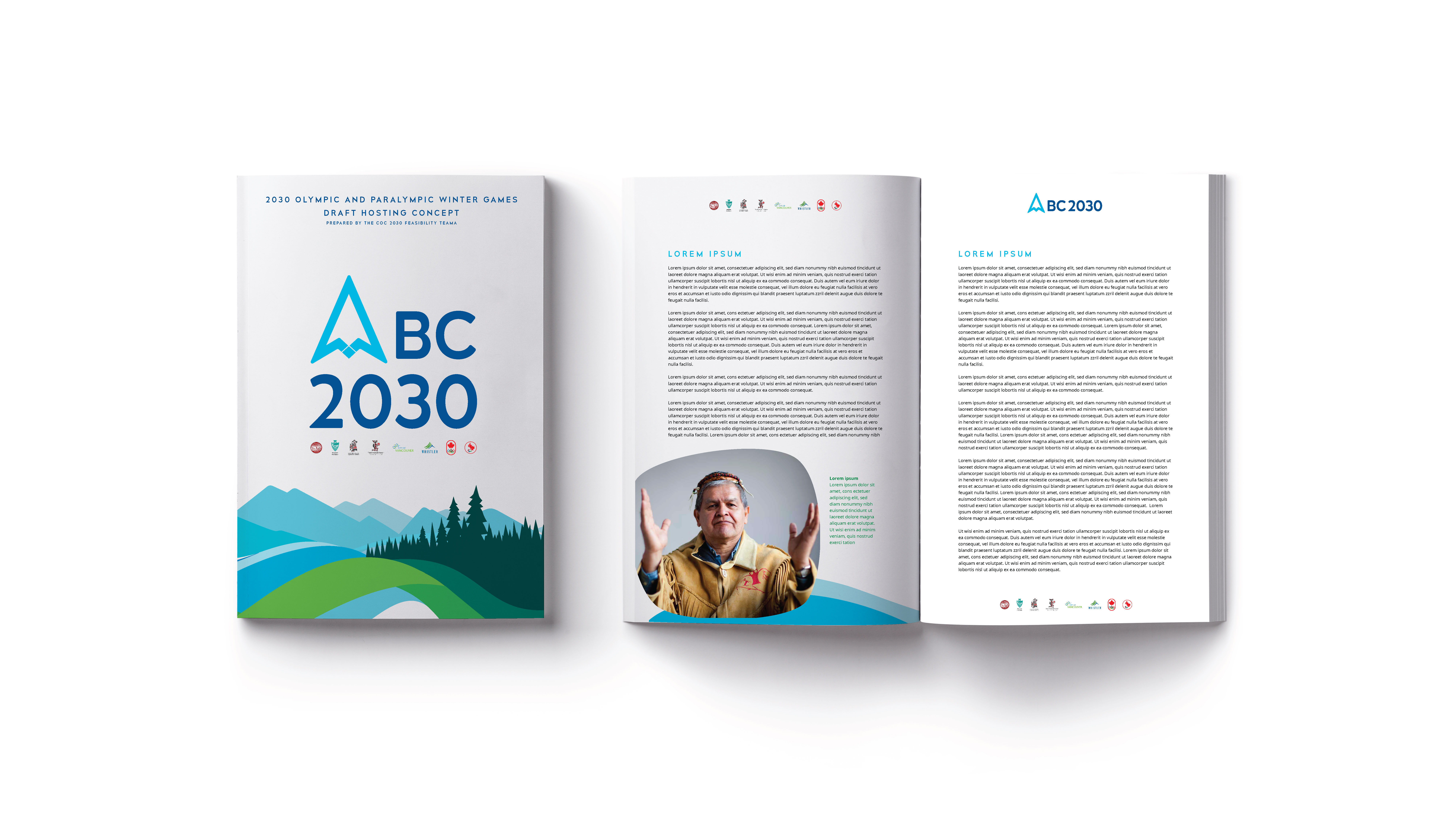
BC 2030
Design
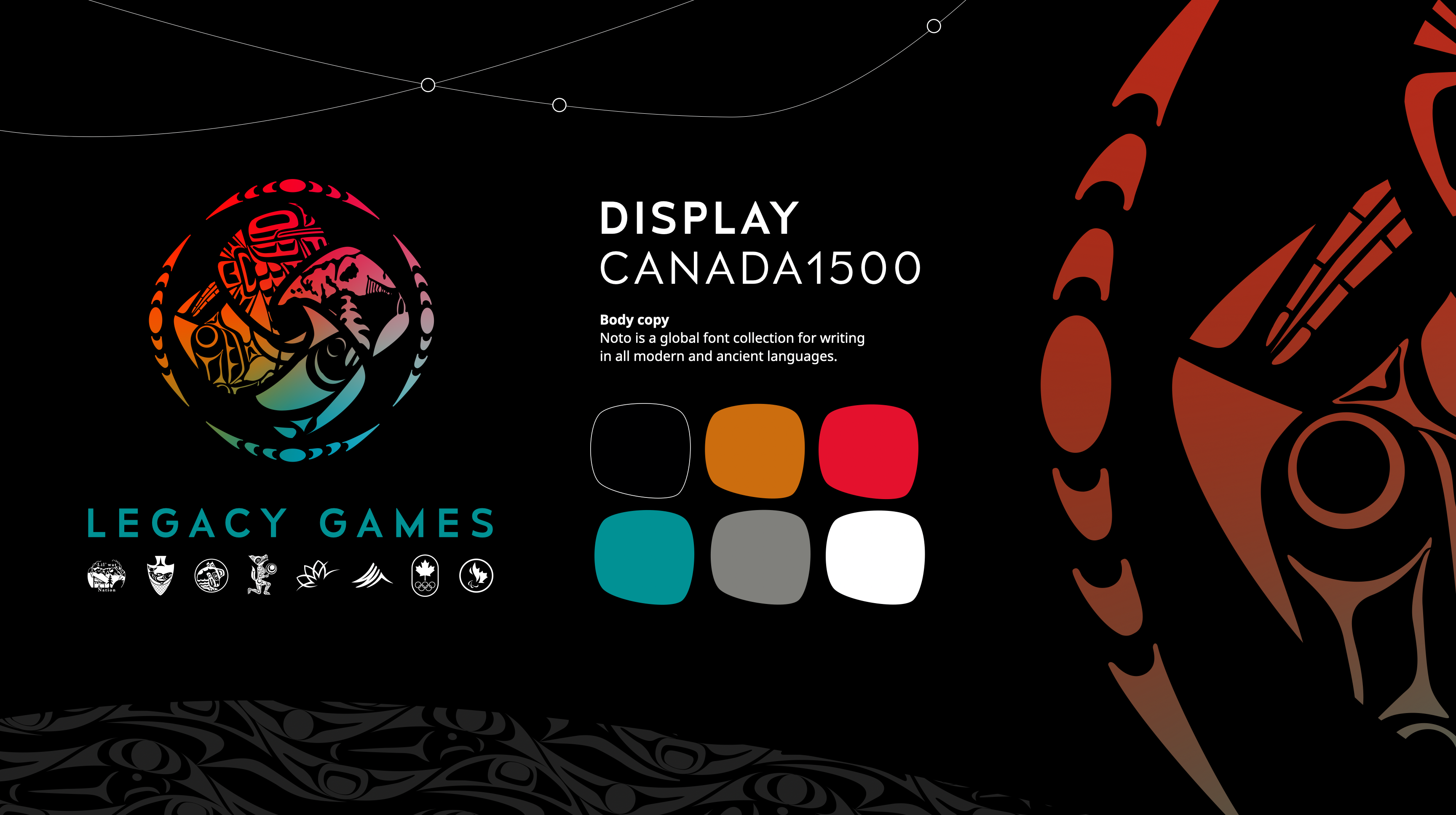
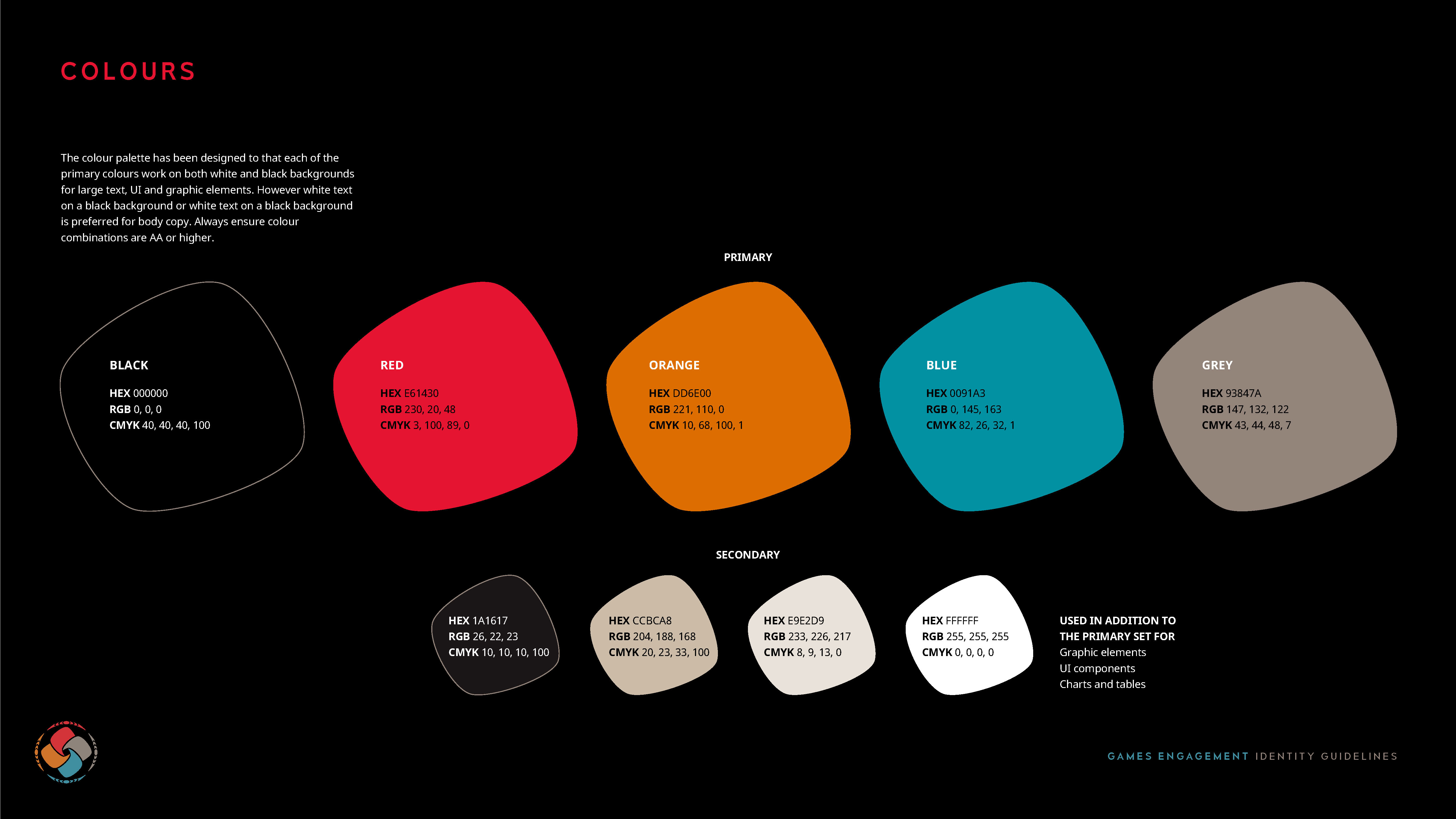
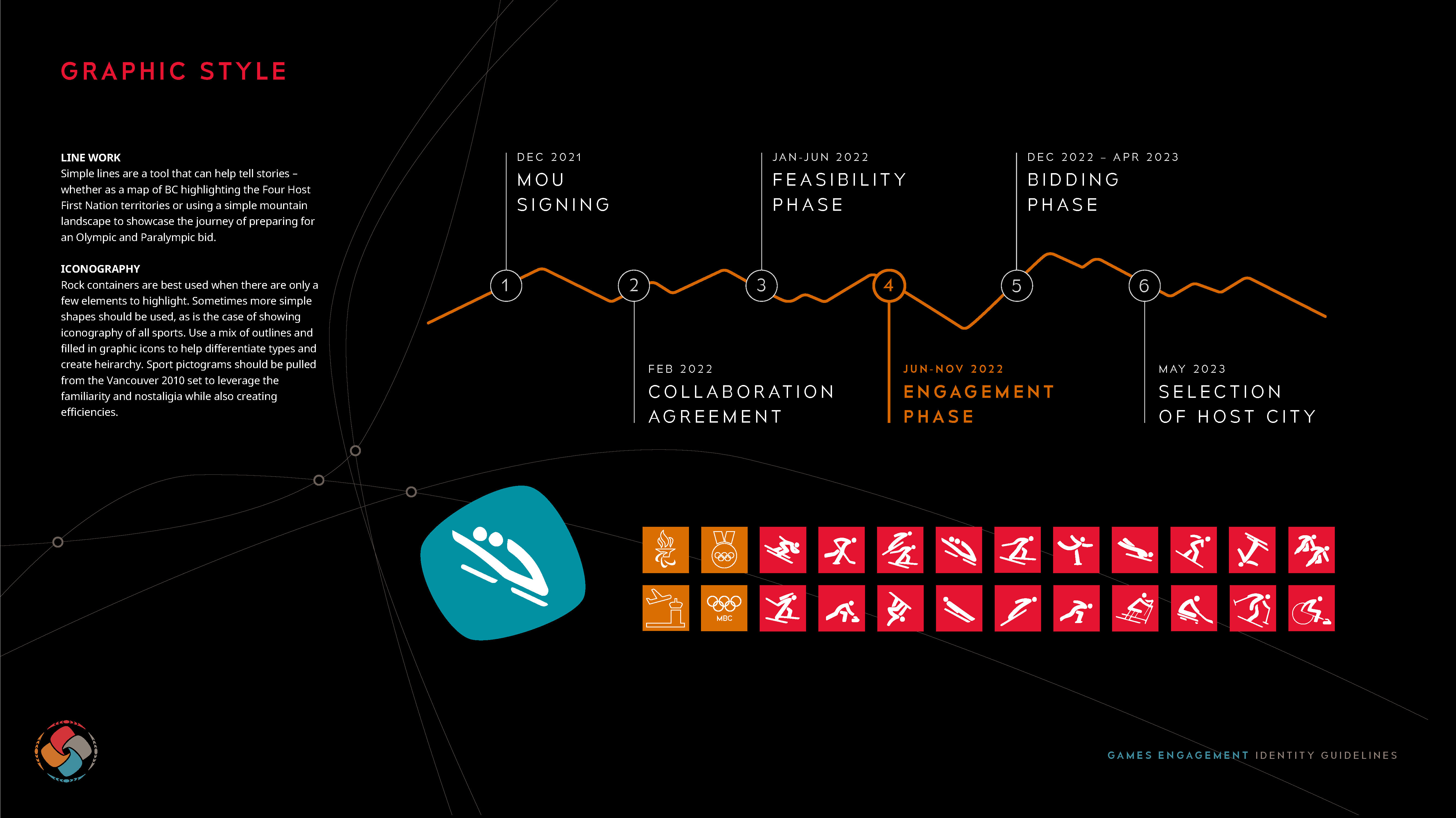
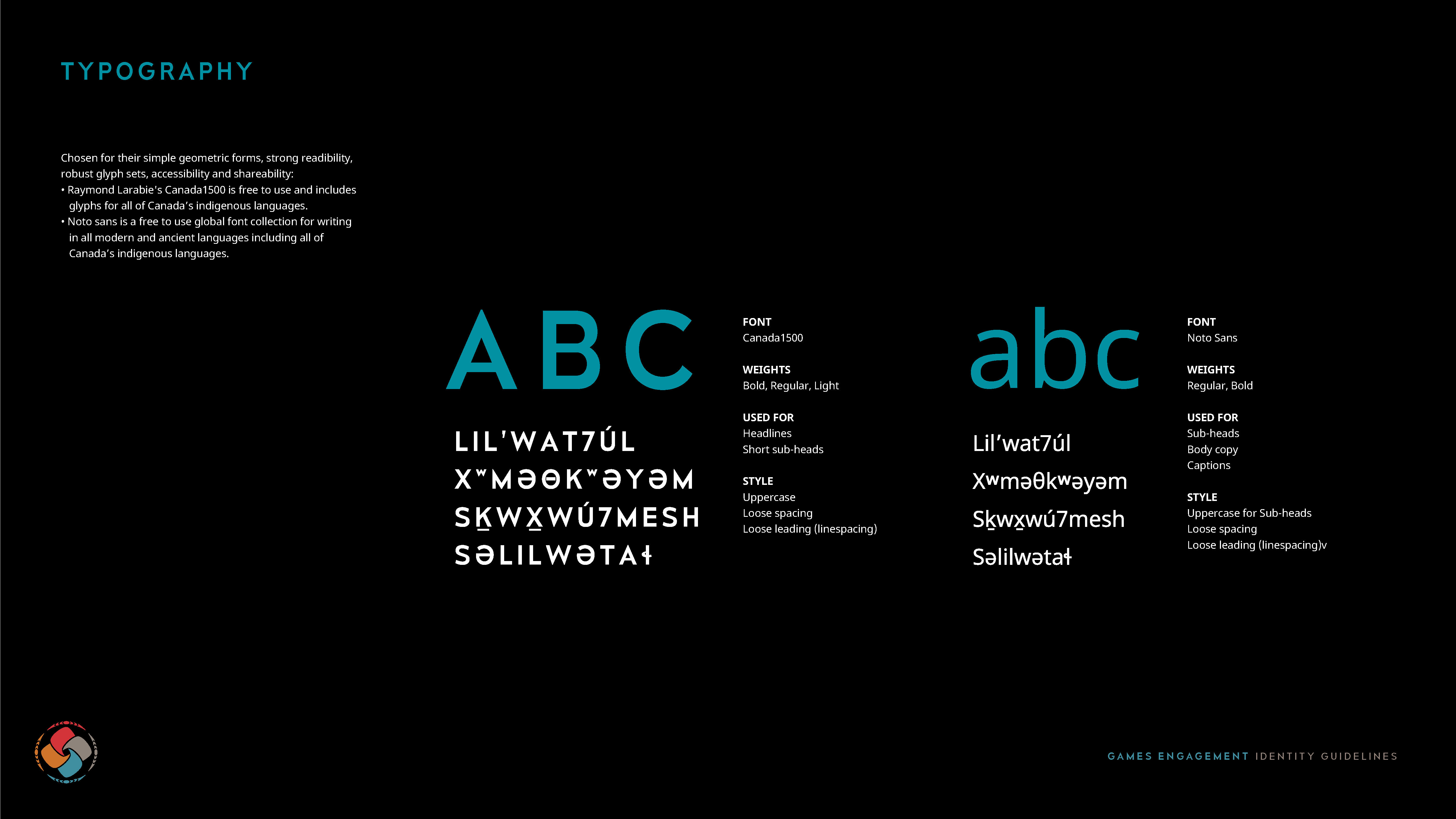
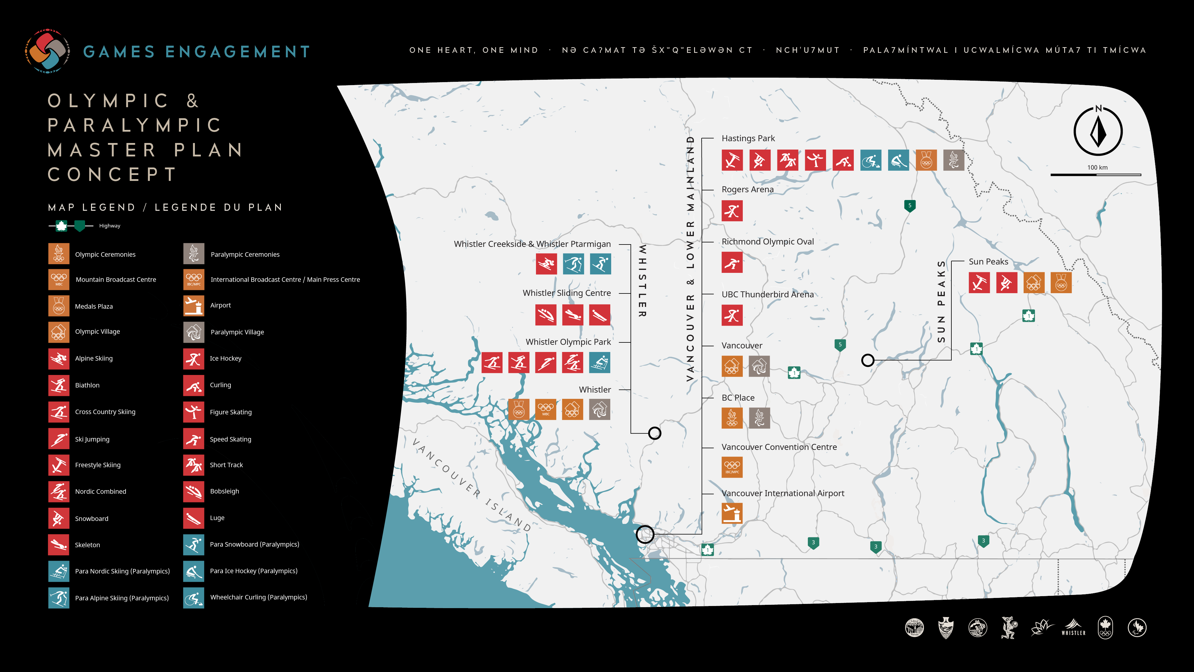
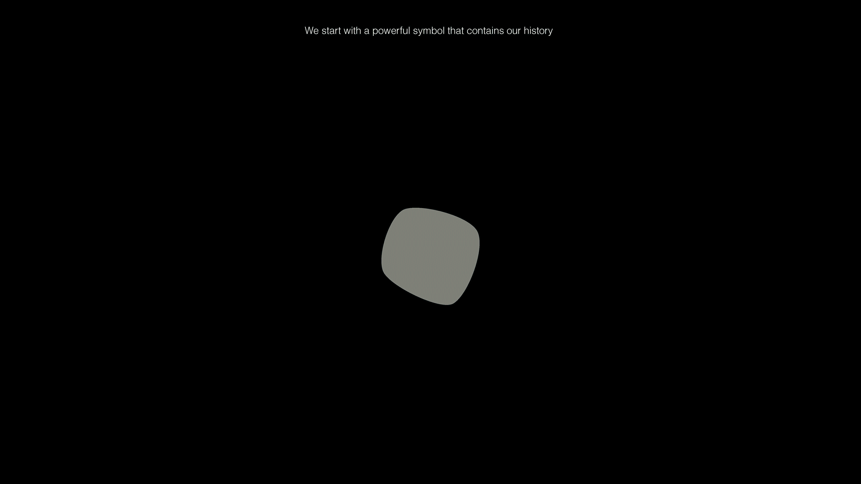
In anticipation of a potential bid for the Winter Olympic Games, The 2030 Feasibility Team—comprised of the Lil’wat7úl (Lil’wat), xʷməθkʷəyəm (Musqueam), Sḵwxwú7mesh (Squamish), and səlilwətaɬ (Tsleil-Waututh) First Nations, along with the City of Vancouver, the Resort Municipality of Whistler, the Canadian Olympic Committee, and the Canadian Paralympic Committee—needed a strong visual identity to claim the narrative early and build excitement. Leading with the Four Host First Nations (FHFN) and honoring the legacy of Vancouver 2010, the identity system was designed to be inclusive, accessible, and impactful. The core elements included a powerful symbol featuring four interwoven rocks representing the FHFN, arranged to signify unity and renewal, with colors inspired by the earth. A chosen typographic family seamlessly integrated Latin characters with Indigenous syllabics, reinforcing cultural depth.
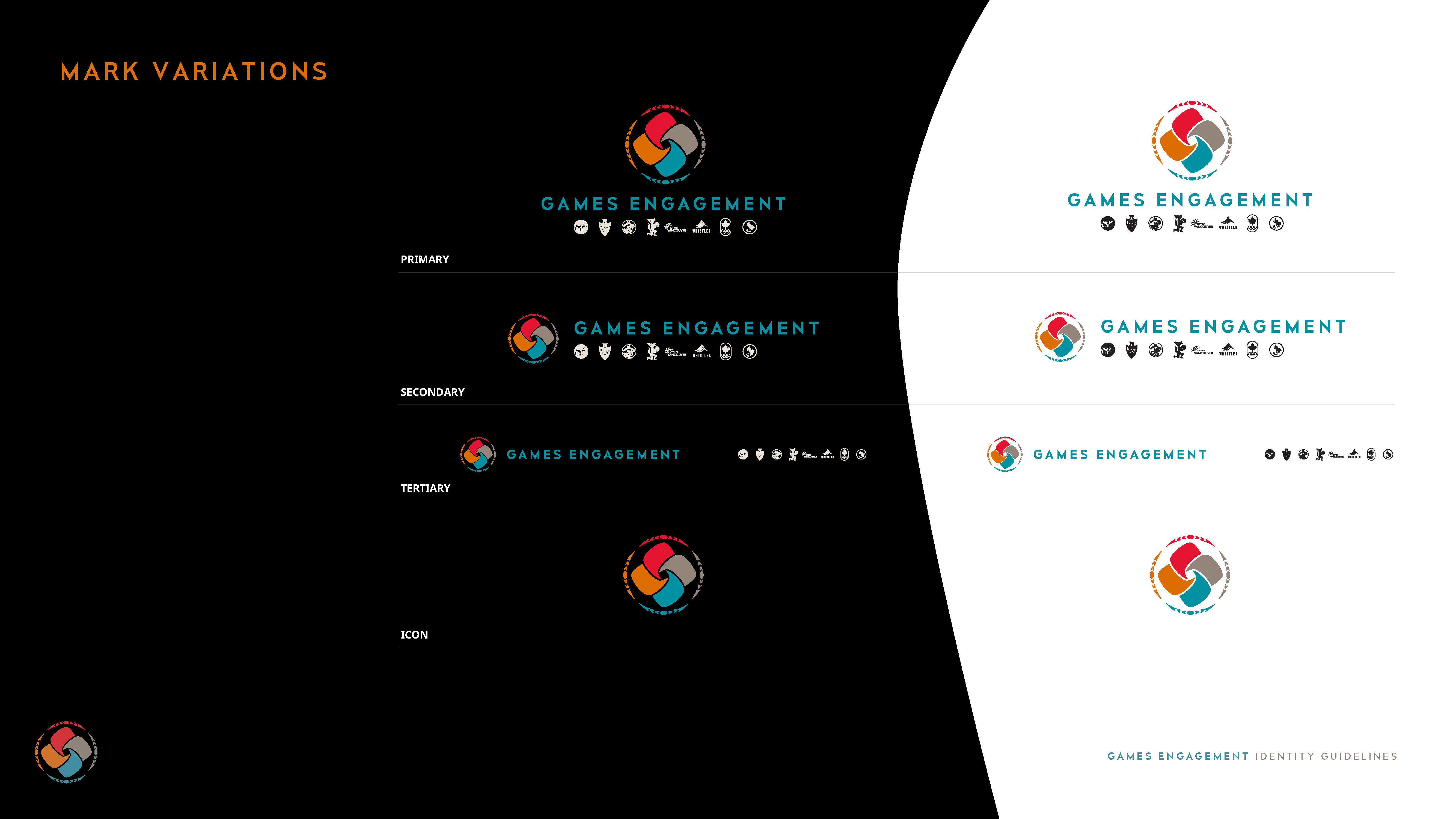
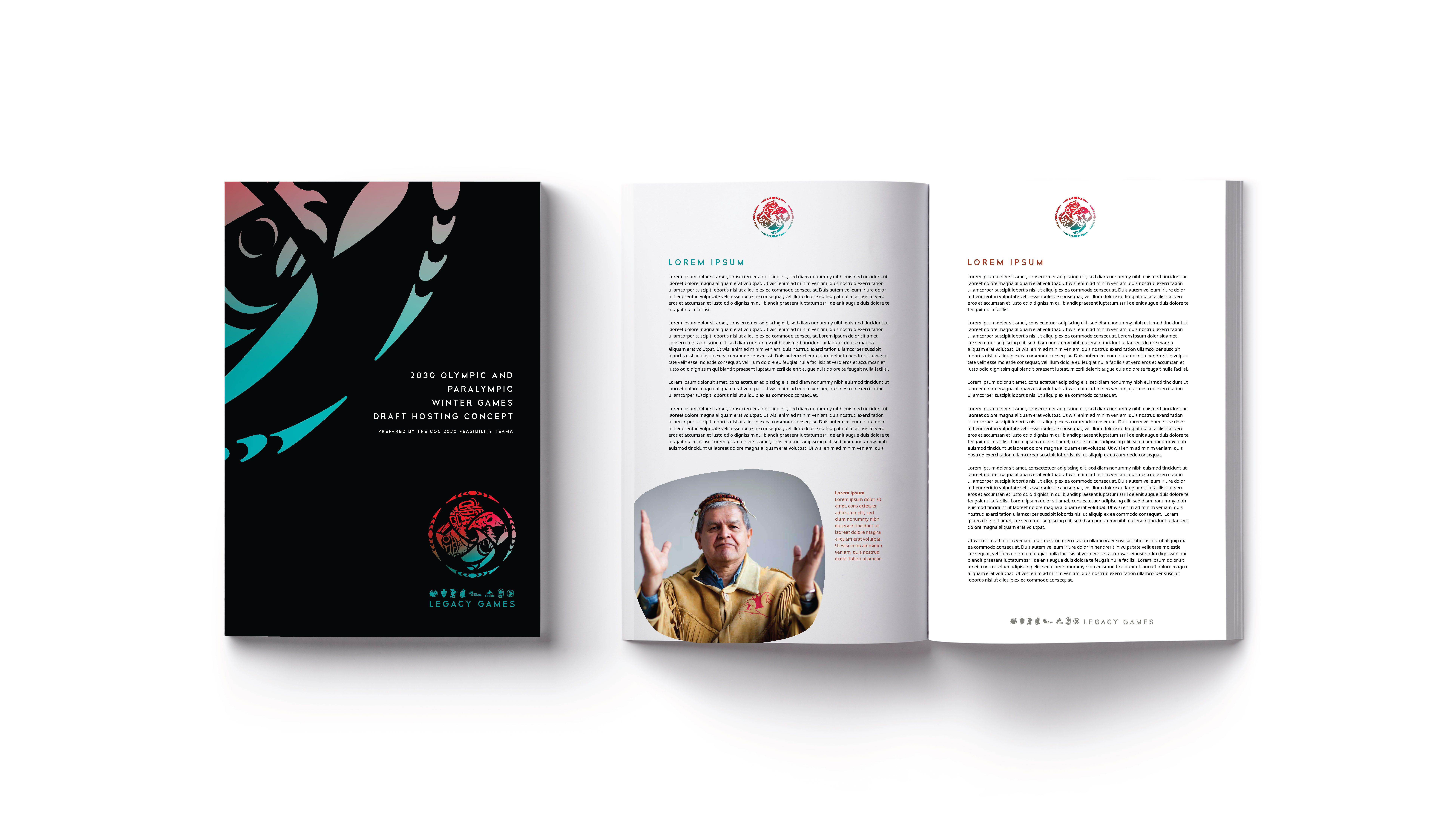
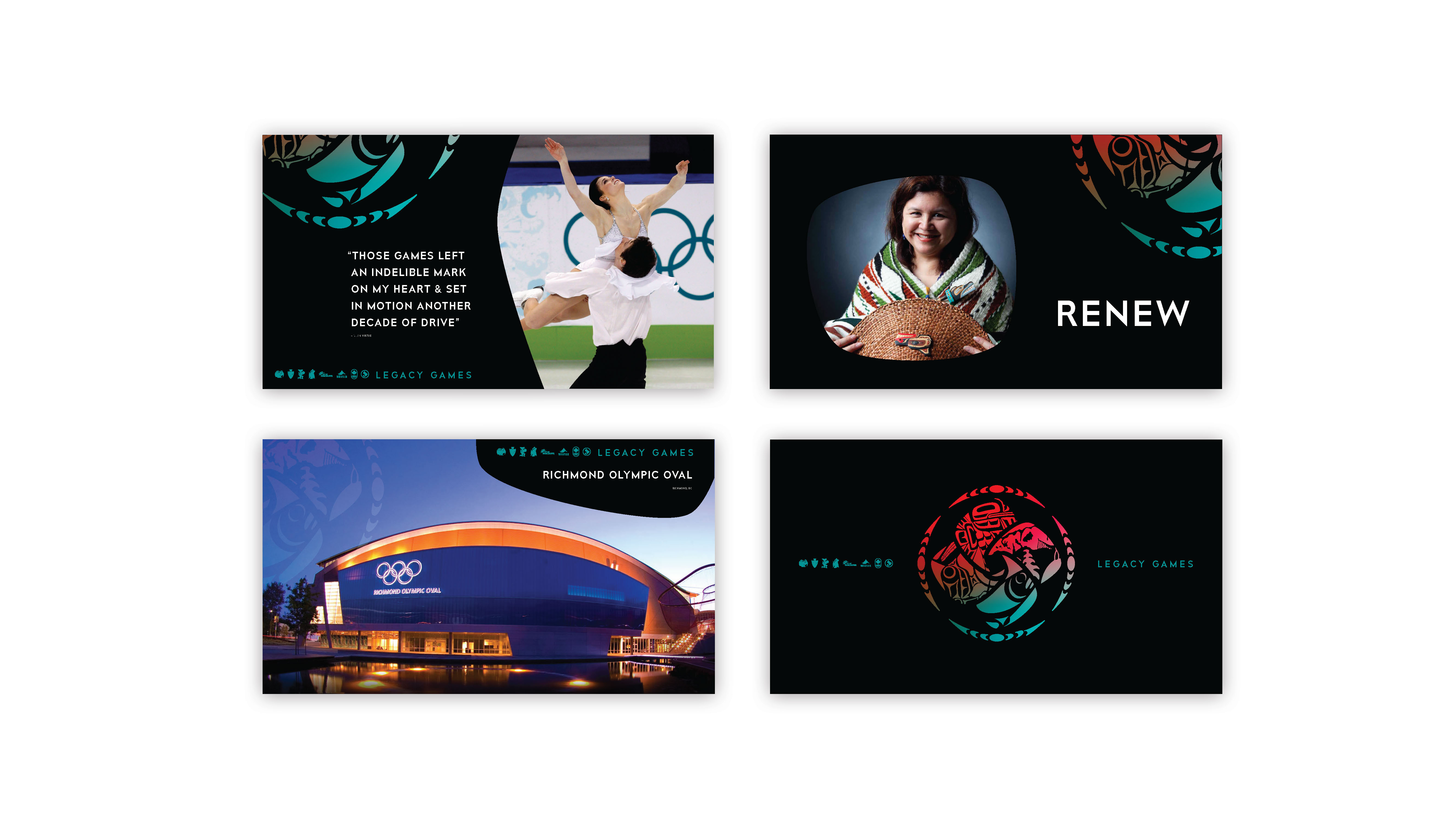
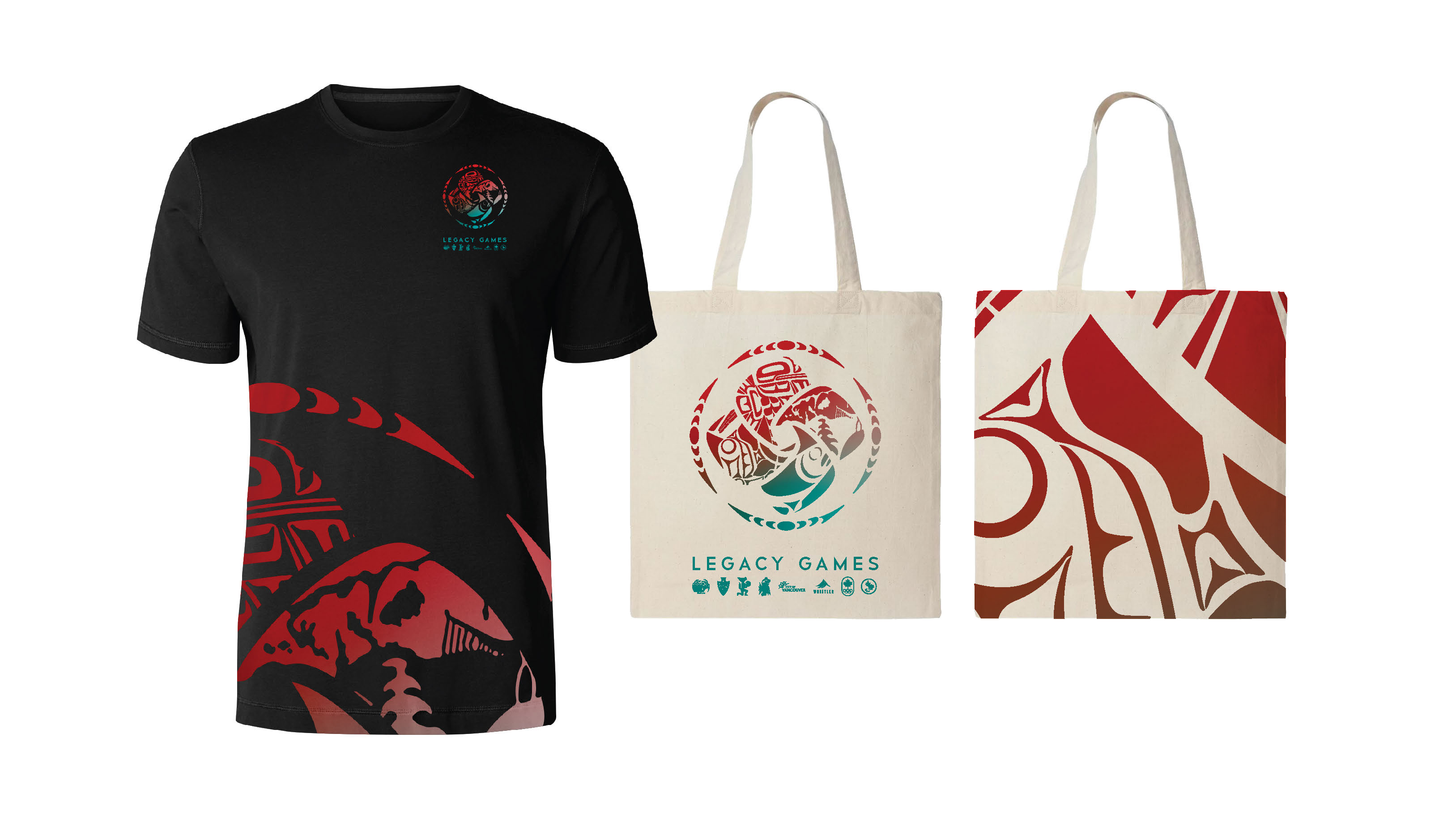
The design system encompassed branding assets such as a mark, colour palette, typography, graphic elements, and applications across digital and print platforms, including website, video graphics, and social media. Designed for consistency and flexibility, it ensured alignment across all communications prepared by The 2030 Feasibility Team. Prioritizing a fast rollout while leaving room for future expansion, the identity successfully positioned the initiative as a forward-thinking and culturally rooted movement, generating momentum for the potential Olympic bid, with its strength further enhanced by collaborations with creatives from the Four Host First Nations.
The design system encompassed branding assets such as a mark, colour palette, typography, graphic elements, and applications across digital and print platforms, including website, video graphics, and social media. Designed for consistency and flexibility, it ensured alignment across all communications prepared by The 2030 Feasibility Team. Prioritizing a fast rollout while leaving room for future expansion, the identity successfully positioned the initiative as a forward-thinking and culturally rooted movement, generating momentum for the potential Olympic bid, with its strength further enhanced by collaborations with creatives from the Four Host First Nations.

Concept 2
Chosen Direction